
Use the correct color of TrueMoney brand.
Understanding their meaning and why?
They express brand pesonality.

Why orange?
It suggests positive, creative, excitement, energetic, warmth, cheerful and playful while also maintaining
a friendly appeal. Orange can also non-obtrusive and inviting and combines well with other colors (red,
yellow, blue and green).
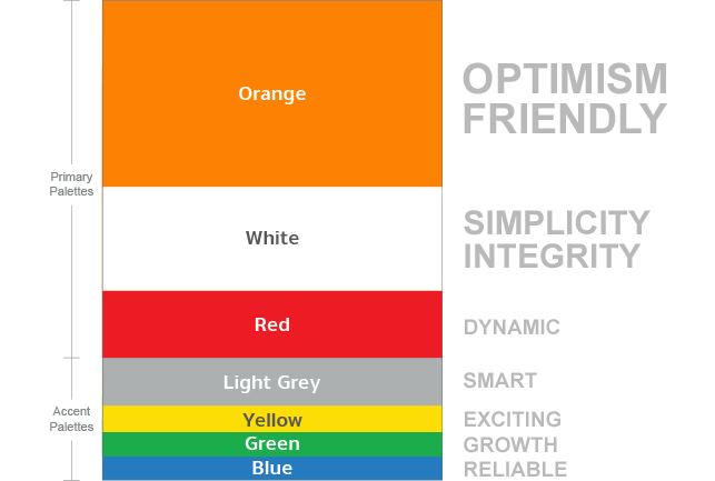
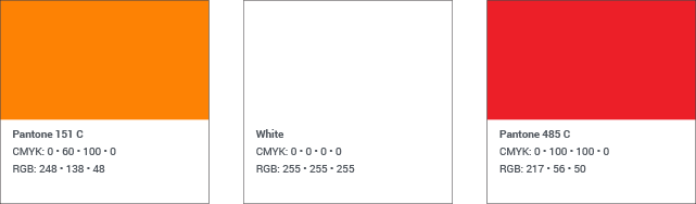
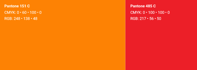
The TrueMoney main palette consists of three colors: TrueMoney orange, white and red. TrueMoney orange is the core of our brand identity and should appear whenever possible for members to immediately identify our brand.
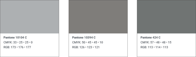
Various shades of cool gray can be used to add texture and depth to text, backgrounds, and illustrations. A few examples of some of our grays are outlined below:
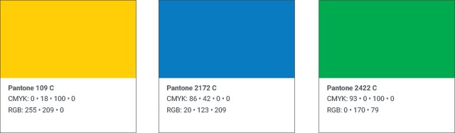
The TrueMoney accent palette consists of three bright colors chosen to have high visibility. These colors should be used sparingly in the design elements.
Learn how best to paint with our palette.
Our colors have been carefully chosen to work well with our corporate palette. Stick to these colors and you can't go wrong. The “eyedropper” or color sampling tool is inaccurate. For best color reproduction, follow the numbers in the color guidelines.

Accent colors don't dominate a design, they compliment our corporate color palette.